Pink Rentry dividers have become a popular aesthetic element for users who love customizing their online pages with soft, visually pleasing designs. Whether you are creating a Rentry bio page, aesthetic profile layout, roleplay profile, fandom page, or personal aesthetic website, pink dividers add charm, organization, and personality to your content. These small decorative elements may seem simple, but they can completely transform the visual flow of a page by separating sections while maintaining a cohesive theme.
In the world of aesthetic web layouts, color plays an important role in creating mood and atmosphere. Pink, in particular, has become one of the most beloved aesthetic colors online. It represents softness, warmth, creativity, and femininity while also fitting into several popular aesthetic styles such as softcore, kawaii, fairycore, coquette, pastelcore, and romantic aesthetics. When used as dividers on Rentry pages, pink decorations can make the layout feel polished, dreamy, and visually balanced.
One of the biggest reasons pink dividers are trending is because they help structure information without making the page feel boring or overly minimal. Many users struggle with long blocks of text on profile pages. Without visual separation, readers may find the page overwhelming or difficult to scan. Pink dividers solve this problem by acting as visual separators between sections, making content easier to read while adding decorative flair.
For example, imagine a Rentry page that includes sections such as About Me, Interests, Favorite Games, Social Links, Boundaries, and Credits. Without dividers, the page can look cluttered and confusing. However, by adding pink dividers between each section, the layout immediately feels organized and aesthetically pleasing. Readers can easily move through the page while enjoying the soft visual theme.
Another reason pink Rentry dividers are loved by aesthetic creators is their versatility. They can range from simple minimalist lines to elaborate decorative elements featuring hearts, flowers, sparkles, ribbons, bows, stars, or butterflies. Some dividers are made with cute text symbols, while others use aesthetic ASCII art. This wide variety allows users to match dividers perfectly with their page theme.
For instance, a kawaii-themed Rentry page might use pink dividers made of hearts and stars, while a fairycore page might feature delicate floral or sparkle-style dividers. A coquette aesthetic layout might use bows, lace patterns, or romantic heart dividers to maintain its soft, feminine theme. Because of this flexibility, pink dividers work beautifully with many different aesthetics.
Pink dividers also help create a sense of storytelling within a page. When readers scroll through a profile or personal page, dividers guide their journey from one section to the next. Each divider acts like a visual pause, allowing the reader to transition smoothly between topics. This makes the overall page feel more intentional and thoughtfully designed.
Many creators also enjoy collecting and sharing divider designs as part of aesthetic communities. On platforms like Pinterest, Tumblr, and aesthetic profile hubs, users often save divider collections to use in their layouts later. These collections include dozens of variations, from simple pastel lines to intricate decorative frames. As a result, pink Rentry dividers have become an essential part of aesthetic web design for many online creators.
Another benefit of pink dividers is that they are extremely easy to use. Even beginners who have never customized a page before can quickly add them to their Rentry layout. Because Rentry supports simple text formatting, dividers can be added by copying and pasting them directly into the page. This makes aesthetic customization accessible to everyone, regardless of design experience.
Beyond aesthetics, dividers also help improve the readability of long pages. When a page includes many sections, readers often skim rather than read every line. Clear visual separation helps readers quickly find the information they are looking for. Pink dividers accomplish this while still maintaining a soft, beautiful aesthetic.
There is also a creative element involved in choosing the right divider style. Some users prefer minimalist designs, while others enjoy decorative, detailed dividers that become a central visual feature of the page. Mixing different styles can also create a dynamic layout. For example, a creator might use simple pink lines for smaller sections and larger decorative dividers for major section breaks.
In recent years, aesthetic web design has become more popular as people seek ways to express their identity online. Personal profile pages are no longer just informational—they are creative spaces where users can showcase their interests, personality, and style. Pink Rentry dividers contribute to this creative expression by allowing users to design pages that feel unique and visually engaging.
Additionally, pink dividers pair beautifully with other decorative elements such as sparkles, emojis, pastel symbols, and aesthetic text styles. When combined thoughtfully, these elements create a cohesive visual theme that enhances the overall page experience.
For content creators, roleplayers, and fandom members, a well-designed Rentry page can become a digital introduction that reflects their aesthetic taste. Pink dividers help achieve this by giving the layout structure while maintaining softness and charm.
Ultimately, pink Rentry dividers are more than just decorative lines. They are tools for organization, creativity, and visual storytelling. By separating sections while enhancing aesthetic appeal, they allow creators to transform simple text pages into beautifully styled personal spaces.
As aesthetic page design continues to grow in popularity, pink divider styles will likely continue evolving. New creative patterns, symbols, and themes will keep inspiring users to experiment with their layouts. Whether someone prefers simple pastel lines or elaborate floral dividers, the possibilities for customization are nearly endless.
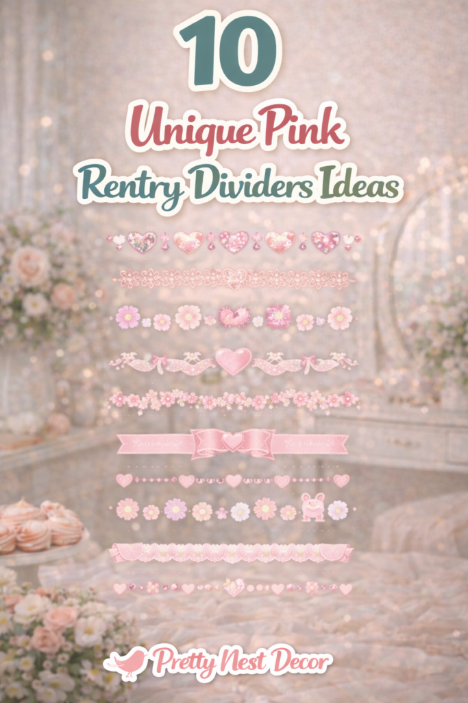
In this article, we will explore a variety of beautiful pink Rentry divider ideas that can elevate your aesthetic page. From cute heart designs to dreamy fairycore separators, these divider styles will help you create a page that feels polished, cohesive, and uniquely yours. 🌸✨
1. Soft Pink Heart Divider
Introduction
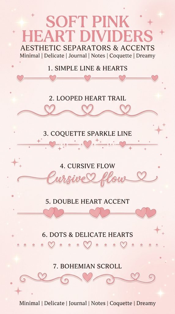
Soft pink heart dividers are one of the most popular decorative separators used in aesthetic Rentry pages. These dividers create a gentle and romantic visual break between sections while keeping the page cohesive and visually appealing. Many users choose heart-themed dividers because they instantly communicate warmth, sweetness, and personality. If your Rentry page follows aesthetics such as coquette, softcore, kawaii, or romantic themes, heart dividers are a perfect choice.
The beauty of heart dividers is their versatility. They can be minimal and subtle or more decorative depending on how many symbols you use. Some layouts include a simple repeating heart pattern, while others combine hearts with sparkles, dots, or stars to create a more whimsical appearance. These small decorative touches make scrolling through the page more enjoyable and visually organized.
Heart dividers also help separate important sections such as About Me, Interests, DNI lists, boundaries, or social links. Instead of having large blocks of text, the divider provides a clear pause between topics. This improves readability and helps visitors navigate your page more easily.
Because they are easy to copy and paste, heart dividers are ideal for beginners who want a cute aesthetic page without complicated formatting.
Definition / Explanation
A pink heart divider is a decorative line made from heart symbols and aesthetic characters that visually separates sections on a Rentry page while maintaining a soft, romantic theme.
Step-by-Step How to Create
- Choose your heart symbol style (♡, ♥, ❥, or ❤).
- Select a repeating pattern such as hearts with dots or stars.
- Copy the divider pattern.
- Paste it between different sections of your Rentry page.
- Keep spacing consistent so the layout looks balanced.
- Use the same divider style throughout the page for visual harmony.
Example Divider
♡ ⋆ ♡ ⋆ ♡ ⋆ ♡ ⋆ ♡ ⋆ ♡
Characters / Materials Used
- ♡ heart symbol
- ⋆ sparkle symbol
- dots or small spacing characters
- optional pastel emojis
2. Sparkly Pink Star Divider
Introduction
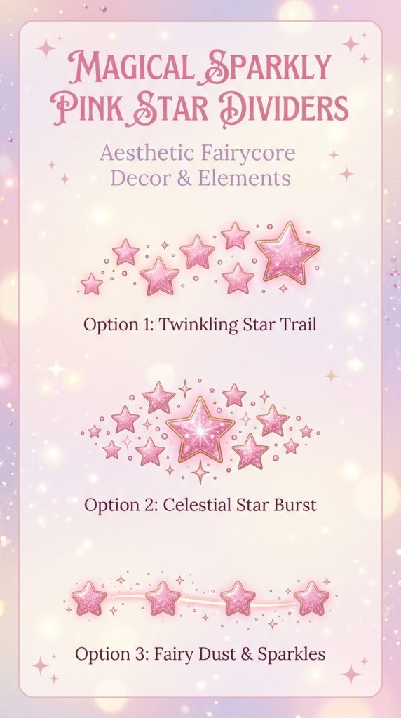
Sparkly star dividers are perfect for creating a dreamy and magical atmosphere on your Rentry page. These dividers are especially popular among users who love fairycore, magical girl aesthetics, pastel themes, and celestial designs. Stars and sparkles symbolize wonder, imagination, and creativity, making them an excellent choice for aesthetic profile pages.
The main appeal of star dividers lies in their glowing, whimsical appearance. When used between sections, they make the page feel lighter and more visually engaging. Instead of plain lines, these sparkles act as tiny decorative elements that guide readers through the page while adding personality.
Many creators combine star dividers with other soft elements like hearts, moons, or flowers to enhance the magical vibe. For example, a fairycore page might feature sparkles mixed with tiny flowers, while a pastel-themed page might combine stars with pink hearts.
Star dividers are also great for highlighting important sections. Placing them before titles like “About Me” or “Favorite Games” can make those sections stand out more clearly.
Because they are simple symbol combinations, sparkly dividers are beginner-friendly and easy to customize based on your aesthetic.
Definition / Explanation
A sparkly star divider is a decorative separator made from star and sparkle characters that adds a magical aesthetic touch to a Rentry layout.
Step-by-Step How to Create
- Choose sparkle symbols such as ✦, ✧, or ✨.
- Create a repeating pattern with spacing for balance.
- Combine stars with small decorative symbols if desired.
- Copy the pattern and place it between page sections.
- Keep the divider centered for visual balance.
Example Divider
✧ ✦ ✧ ✦ ✧ ✦ ✧ ✦ ✧
Characters / Materials Used
- ✧ sparkle symbol
- ✦ star symbol
- ✨ optional sparkle emoji
- spacing characters
3. Cute Bow Ribbon Divider
Introduction
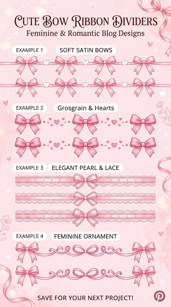
Bow ribbon dividers are a beautiful choice for people who love coquette, feminine, and soft aesthetic themes. Bows symbolize elegance, charm, and delicacy, making them a perfect decorative element for romantic page designs. On Rentry pages, bow dividers act as decorative separators while reinforcing a soft pink visual theme.
The ribbon-like shape of bow dividers makes them feel more decorative than standard separators. They often include repeating bow characters surrounded by dots, hearts, or soft lines. This combination creates a visual style that resembles delicate ribbons stretching across the page.
Many users include bow dividers in sections that showcase personal interests, fashion inspirations, or aesthetic collections. Because bows are strongly associated with feminine aesthetics, they are often used in coquette layouts, kawaii profiles, and soft pastel pages.
Another advantage of bow dividers is that they pair beautifully with pastel fonts, sparkles, and soft emojis. When used consistently, they create a cohesive design that feels elegant and polished.
These dividers are simple to use, making them perfect for beginners who want a charming and decorative page layout.
Definition / Explanation
A bow ribbon divider is a decorative separator using bow symbols arranged in a repeating pattern to create a soft ribbon-like aesthetic line across the page.
Step-by-Step How to Create
- Choose a bow symbol such as 🎀.
- Place spacing or dots between each bow.
- Repeat the pattern until it forms a line across the page.
- Center the divider between sections.
- Use it consistently throughout the page.
Example Divider
🎀 • 🎀 • 🎀 • 🎀 • 🎀
Characters / Materials Used
- 🎀 bow symbol
- • dot separator
- spacing characters
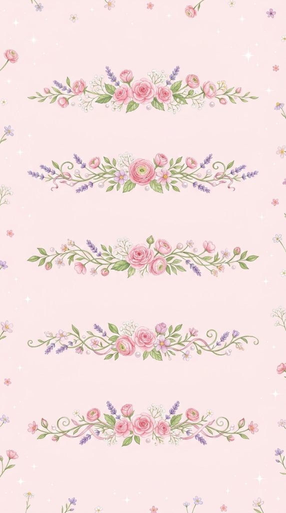
4. Floral Pink Divider
Introduction
Floral pink dividers are ideal for people who love nature-inspired aesthetics such as cottagecore, fairycore, and garden themes. These dividers incorporate flower symbols to create a gentle and refreshing decorative separator. They bring a natural, spring-like atmosphere to Rentry pages and are especially popular among aesthetic profile creators.
Flowers symbolize growth, beauty, and creativity. When used as dividers, they make a page feel soft and welcoming. Many floral dividers use combinations of blossoms, leaves, and small sparkles to create an organic design that resembles a flower garland.
Floral separators work especially well on pages that feature themes like favorite hobbies, art inspiration, nature photography, or aesthetic collections. They help maintain a calm and visually pleasing environment while separating information into neat sections.
Another benefit of floral dividers is that they complement pastel color palettes extremely well. Pink flowers combined with soft symbols create a dreamy aesthetic that many Pinterest-style layouts aim for.
Because of their decorative charm and simplicity, floral dividers remain one of the most timeless Rentry decoration styles.
Definition / Explanation
A floral divider is a decorative line made of flower symbols and aesthetic characters used to separate sections while maintaining a nature-inspired theme.
Step-by-Step How to Create
- Choose flower characters such as ❀, ✿, or 🌸.
- Combine flowers with dots or sparkles.
- Repeat the pattern to create a full divider line.
- Center it between sections of your Rentry page.
- Use matching floral symbols across the layout.
Example Divider
❀ ✿ ❀ ✿ ❀ ✿ ❀ ✿
Characters / Materials Used
- ❀ flower symbol
- ✿ blossom symbol
- 🌸 optional emoji
- sparkle or dot separators
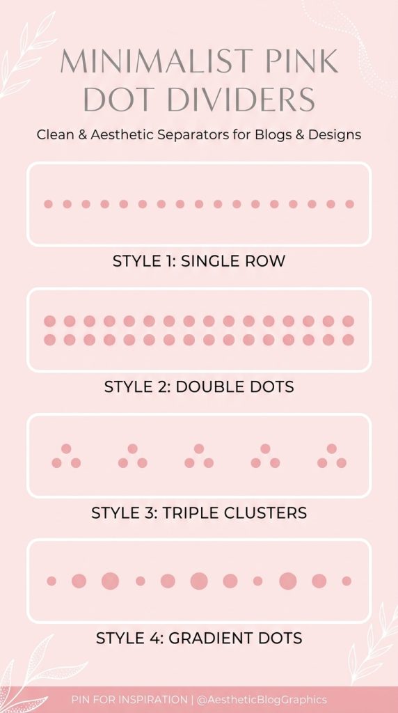
5. Minimalist Pink Dot Divider
Introduction
Minimalist pink dot dividers are perfect for users who prefer clean, simple, and modern page layouts. Unlike decorative dividers with many symbols, dot dividers focus on subtle visual separation while keeping the page uncluttered. This makes them a great choice for people who want a polished layout without too many decorative elements.
Minimalist designs are extremely popular in modern web aesthetics because they create balance and readability. A simple line of evenly spaced dots can effectively separate sections while maintaining a soft and aesthetic appearance. When combined with pastel themes, dot dividers still feel gentle and stylish.
These dividers work particularly well for pages that contain large amounts of information. They help guide readers through the page without overwhelming them visually. Many creators use dot dividers between smaller subsections while reserving larger decorative dividers for major sections.
Another advantage of minimalist dividers is flexibility. They can match nearly any aesthetic theme, including softcore, pastel, minimal, or modern layouts. Their simplicity makes them a safe and elegant design choice.
Definition / Explanation
A minimalist dot divider is a clean decorative line made of evenly spaced dots that separates content while maintaining a simple aesthetic.
Step-by-Step How to Create
- Choose a dot symbol such as • or ·.
- Repeat the dot symbol with consistent spacing.
- Copy the full pattern.
- Paste it between sections of your Rentry page.
- Align it consistently throughout the layout.
Example Divider
• • • • • • • • •
Characters / Materials Used
- • dot symbol
- · small dot symbol
- spacing characters
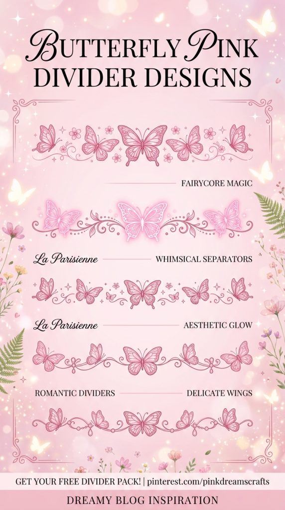
6. Butterfly Pink Divider
Introduction
Butterfly dividers are a beautiful way to add elegance and softness to a Rentry page. Butterflies symbolize transformation, beauty, and freedom, which makes them a perfect decorative element for aesthetic layouts. Many people who design profile pages inspired by fairycore, softcore, pastel aesthetics, and dreamy themes love using butterfly dividers because they create a delicate, whimsical atmosphere.
A butterfly divider acts like a visual ribbon flowing across the page. Instead of plain text separation, the butterflies create a gentle decorative break between sections such as About Me, Interests, Favorite Music, or Social Links. This makes scrolling through the page feel more engaging and visually pleasant.
Butterfly designs also blend well with other aesthetic decorations like sparkles, flowers, or hearts. For example, a pastel-themed Rentry page may combine butterflies with tiny stars to create a dreamy sky-like divider. These combinations help keep the layout cohesive and creative.
Another reason butterfly dividers are popular is that they work beautifully with pink aesthetic themes. The soft shape of the butterfly symbol naturally complements gentle pastel layouts and romantic design styles.
Because they are easy to copy and paste, butterfly dividers are a simple way to instantly upgrade your Rentry page.
Definition / Explanation
A butterfly divider is a decorative separator made using butterfly symbols arranged in a repeating pattern to create a whimsical aesthetic line between sections.
Step-by-Step How to Create
- Choose a butterfly symbol such as 🦋 or ʚɞ.
- Decide whether to combine it with dots or sparkles.
- Repeat the pattern evenly across a line.
- Center the divider between sections.
- Use the same style consistently across the page.
Example Divider
ʚɞ ✦ ʚɞ ✦ ʚɞ ✦ ʚɞ
Characters / Materials Used
- ʚɞ butterfly symbol
- 🦋 butterfly emoji
- ✦ sparkle symbol
- spacing characters
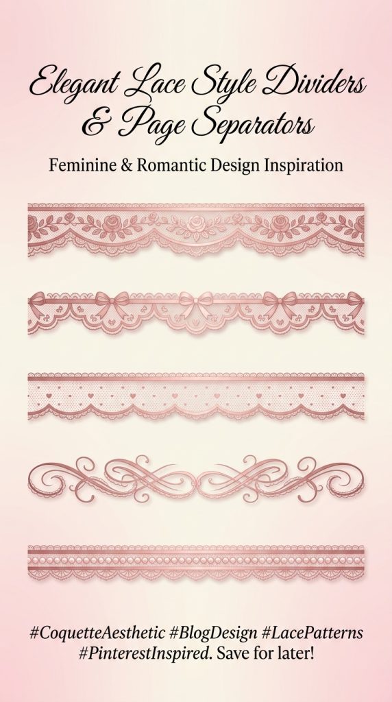
7. Lace Style Pink Divider
Introduction
Lace dividers create an elegant and vintage aesthetic that works beautifully for romantic Rentry pages. Inspired by delicate fabric patterns, lace-style dividers often use repeating symbols to mimic the look of embroidered borders. This design style is extremely popular among users who love coquette, vintage, romantic, and soft feminine aesthetics.
The beauty of lace dividers lies in their intricate appearance. Even though they are made from simple characters, the repeated pattern creates a decorative line that resembles a lace ribbon across the page. This makes the layout feel refined and thoughtfully designed.
Lace dividers are especially effective when used before or after major page sections. For example, they can frame headings such as “About Me”, “Favorites”, or “DNI” lists. Because of their decorative nature, they draw attention without overwhelming the page.
Another advantage of lace dividers is that they blend easily with pastel themes. When combined with hearts, flowers, or bows, they help create a cohesive aesthetic layout.
For creators who enjoy elegant page designs, lace dividers offer a perfect balance between decoration and organization.
Definition / Explanation
A lace divider is a decorative separator that uses repeating characters to create a pattern resembling lace fabric or embroidered borders.
Step-by-Step How to Create
- Choose delicate characters such as ❀, ✿, or ✧.
- Arrange them in a symmetrical repeating pattern.
- Add spacing or dots for texture.
- Repeat until the divider forms a long decorative line.
- Place it between page sections.
Example Divider
✿ ❀ ✿ ❀ ✿ ❀ ✿ ❀
Characters / Materials Used
- ✿ flower symbol
- ❀ blossom symbol
- ✧ sparkle symbol
- spacing characters
8. Sparkle Wave Divider
Introduction
Sparkle wave dividers add movement and flow to a Rentry page layout. Unlike straight divider lines, this style creates a gentle wave-like pattern that feels playful and magical. These dividers are especially popular for fairycore, dreamy aesthetics, magical girl themes, and pastel profile pages.
The wave effect comes from alternating symbols such as sparkles, stars, or dots in a pattern that visually curves across the page. This creates a decorative rhythm that guides the reader’s eyes from one section to the next.
Sparkle wave dividers are excellent for pages that want to feel whimsical without becoming too busy. Because the design includes repeating sparkles, it adds a magical touch while still keeping the layout readable.
Another reason these dividers are trending in aesthetic communities is their versatility. They can be used for both major section breaks and smaller subsections. For example, you might use a sparkle wave divider between music lists, hobbies, aesthetic inspirations, or gaming sections.
The overall result is a Rentry page that feels lively, creative, and visually balanced.
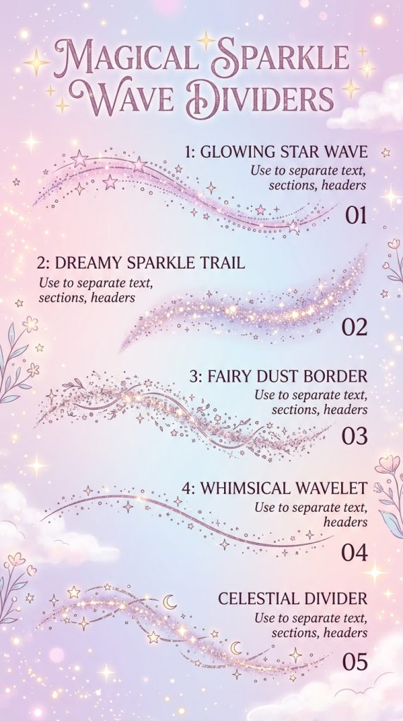
Definition / Explanation
A sparkle wave divider is a decorative separator made by alternating sparkle or star characters to create a flowing wave-like pattern across the page.
Step-by-Step How to Create
- Choose sparkle or star characters.
- Arrange them in alternating positions to mimic a wave.
- Repeat the pattern several times.
- Center the divider for visual balance.
- Place it between sections.
Example Divider
✦ ⋆ ✧ ⋆ ✦ ⋆ ✧ ⋆ ✦
Characters / Materials Used
- ✦ star symbol
- ✧ sparkle symbol
- ⋆ decorative star
- spacing characters
9. Kawaii Emoji Divider
Introduction
Kawaii emoji dividers are playful and expressive separators that add personality to Rentry pages. This style is inspired by Japanese internet aesthetics where cute emojis and symbols are used to decorate text layouts. Kawaii dividers are perfect for people who love cute themes, pastel aesthetics, gaming profiles, or anime-inspired layouts.
Unlike minimalist dividers, kawaii emoji dividers are meant to be fun and colorful. They often include hearts, stars, bows, or cute objects arranged in a repeating pattern. This makes the page feel friendly and cheerful.
These dividers are especially effective for sections that showcase personal interests. For example, they work well when separating favorite games, favorite anime, hobbies, or collections. The cute icons help reinforce the playful mood of the page.
Another benefit of emoji dividers is that they are extremely easy to customize. Users can choose emojis that match their personality or page theme. This flexibility allows each Rentry page to feel unique.
Because kawaii aesthetics are widely loved on platforms like Pinterest and Tumblr, these dividers remain a popular choice for aesthetic page design.
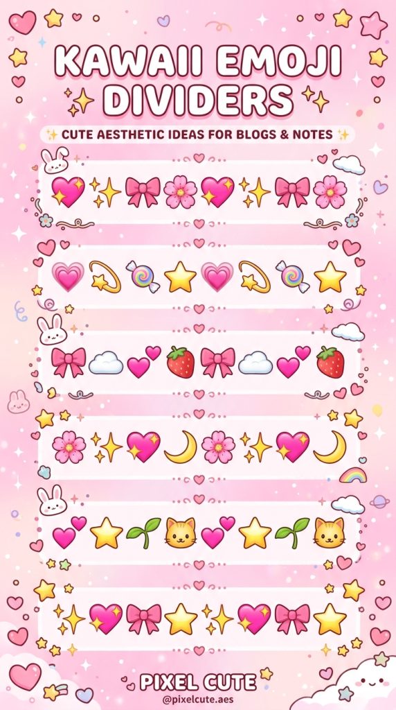
Definition / Explanation
A kawaii emoji divider is a decorative separator made using cute emojis arranged in a repeating pattern to create a playful visual break between sections.
Step-by-Step How to Create
- Choose cute emojis such as hearts, stars, or bows.
- Arrange them in a repeating pattern.
- Keep spacing consistent.
- Copy and paste the divider between sections.
- Use the same emoji theme throughout the page.
Example Divider
💗 ✨ 🎀 ✨ 💗 ✨ 🎀
Characters / Materials Used
- 💗 heart emoji
- 🎀 bow emoji
- ✨ sparkle emoji
- spacing characters
10. Moon and Star Fairycore Divider
Introduction
Moon and star dividers are perfect for creating a dreamy celestial aesthetic on Rentry pages. Inspired by night skies and magical themes, these dividers combine moon symbols with stars or sparkles to create a peaceful and mystical visual separator.
This design style is especially popular among people who love fairycore, celestial aesthetics, astrology themes, and dreamy pastel layouts. The moon symbolizes calmness and mystery, while stars represent imagination and inspiration. Together, they create a divider that feels magical and soothing.
Moon dividers work beautifully in sections related to favorite music, personal thoughts, aesthetic inspiration, or creative projects. They create a gentle visual pause between sections while maintaining a dreamy atmosphere.
Another reason these dividers are loved is their elegance. The simple combination of moon and star symbols can instantly elevate a page’s design without making it cluttered.
For creators who want a magical and calming layout, moon and star dividers are a perfect aesthetic choice.
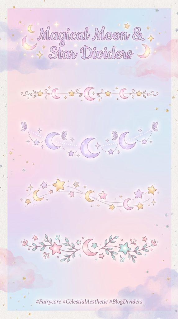
Definition / Explanation
A moon and star divider is a decorative separator that uses moon and star symbols arranged in a repeating pattern to create a celestial aesthetic line.
Step-by-Step How to Create
- Choose moon and star symbols such as ☾ and ✦.
- Alternate the symbols to create a repeating pattern.
- Keep spacing balanced across the line.
- Place the divider between sections.
- Use the same celestial theme across the page.
Example Divider
☾ ✦ ☾ ✦ ☾ ✦ ☾ ✦
Characters / Materials Used
- ☾ moon symbol
- ✦ star symbol
- ✧ sparkle symbol
- spacing characters